

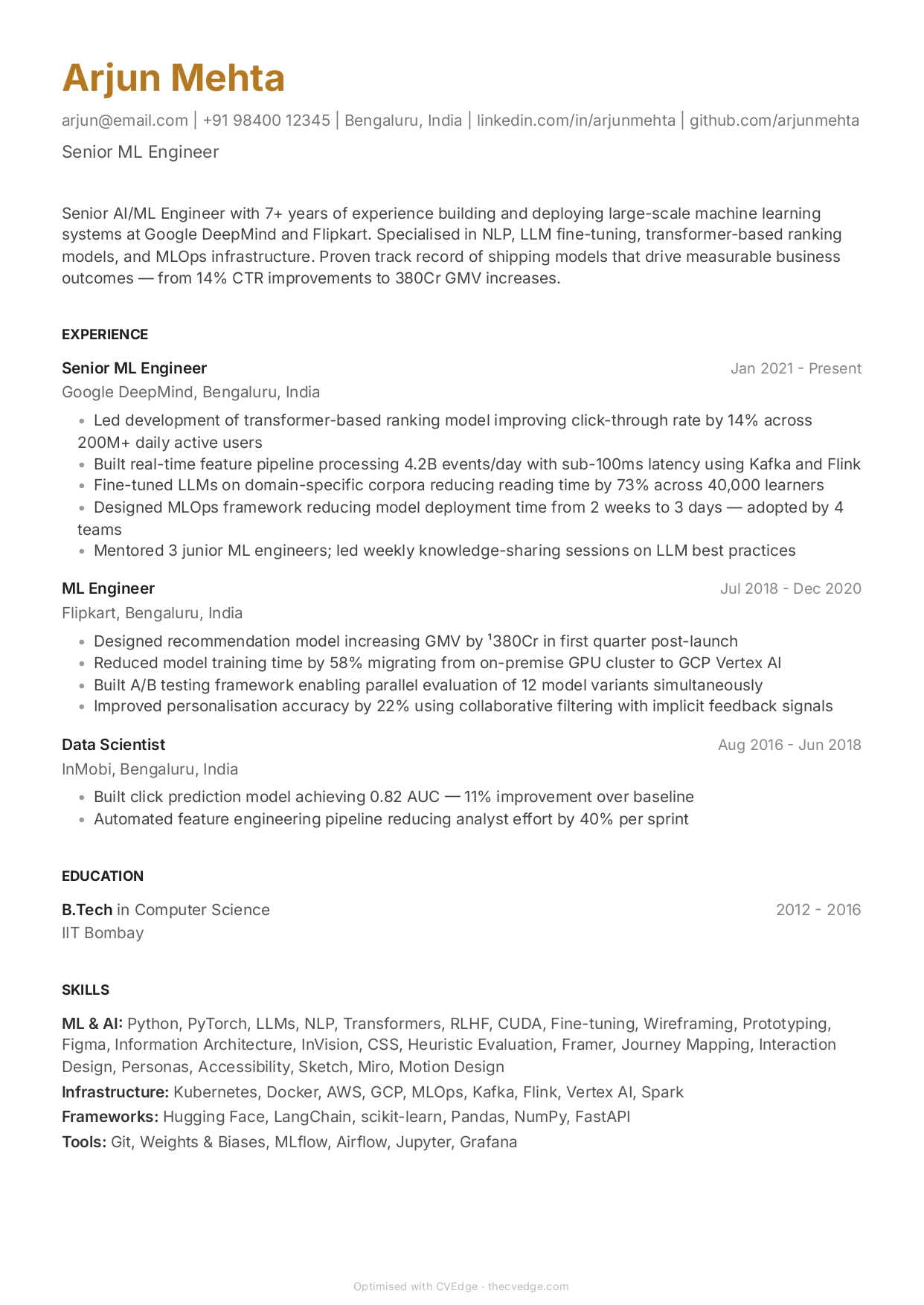
Minimal ATS Resume Template
Zero parsing errors. Maximum whitespace with full ATS compliance.
No credit card · No watermarks · Switch templates any time
About this template
Minimal is the cleanest ATS-safe template CVEdge offers. Zero decoration means zero ATS parsing risk — every element on the page is parsable text. No borders that could confuse column detection, no section dividers that might interrupt content parsing, no font variety that could trip up character recognition.
For professionals in industries where ATS screening is heavily automated — large tech companies, financial services, global enterprises — Minimal eliminates every format variable. The ATS score reflects your content quality alone.
Minimal's generous whitespace also benefits human reviewers. When your resume does pass ATS and reach a recruiter's screen, the layout is immediately readable. High contrast between text and background, generous line spacing — a recruiter scanning 50 resumes in 90 minutes will appreciate it.
Pair Minimal with CVEdge's Fix All ATS for maximum combined score improvement.
Who is this template for?
- Professionals in heavily automated hiring pipelines
- Large tech company applicants (Google, Meta, Amazon, Microsoft)
- Financial services applicants with ATS portals
- Anyone wanting the lowest possible format risk
Start with this template — free
Upload your existing CV or start from scratch. CVEdge pre-fills your content into the template and gives you an instant ATS score.
Why this template works for ats friendly
Minimal strips the page to type and spacing alone — no rules, no shading, no accent colour. It parses as reliably as Classic while reading as more contemporary, which suits product, design-adjacent and startup applications where an overtly corporate document can feel dated. The trade-off is that it offers no visual scaffolding, so the writing has to carry the structure.
Recommended section order
- 1Contact
- 2Summary
- 3Experience
- 4Skills
- 5Education
Minimal's restraint means section headings do all the wayfinding. Keep the order conventional so a reader never has to hunt — the layout is already asking them to do more work than a ruled template would.
What to put where
Summary
Particularly important here. With no visual anchor at the top of the page, the summary is what orients the reader — make it specific in the first line rather than building up to the point.
Experience
Keep bullets to one or two lines. Minimal's lack of dividers means long bullets run together visually, which undoes the clarity you chose the template for.
Skills
A short, deliberately curated list. Minimal punishes clutter more than any other layout — twenty comma-separated technologies look worse here than anywhere else.
Education
Two lines. The aesthetic depends on nothing being longer than it needs to be.
Common mistakes with this template
- Filling the whitespace. The empty space is the design; adding a skills bar chart or a coloured header defeats it and adds parsing risk.
- Long paragraph-style bullets, which lose all structure without dividers to separate them.
- Choosing Minimal for a 15-year career — at that length it becomes an undifferentiated wall of text.
- Reducing the font below 10pt to fit more in, which makes an already-airy layout look cramped and inconsistent.
When to choose something else
Candidates with long careers or dense credential lists that need structural separation will usually be better served by the Ledger layout.
Questions about this template
Is Minimal really better for ATS than Classic?+
They score identically for format safety. Minimal has slightly fewer elements that could theoretically cause issues in edge-case ATS systems. For practical purposes, both are fully ATS-safe.
Does Minimal look too plain for human reviewers?+
Minimal is a deliberate design choice, not a default. Recruiters who see strong content in a clean layout associate it with confidence. The risk is looking sparse if your content is thin — ensure every bullet has impact.
Is a minimal resume too plain for senior roles?+
Plainness is not the issue at senior level — length is. Minimal works well up to around eight to ten years of experience. Beyond that, a career with many roles and credentials needs more structural separation than the layout provides, and readers start to lose their place. If you are senior and want restraint, a template with clearer section rules serves you better than adding decoration to this one.
Does whitespace hurt my ATS score?+
No. Parsers read text and structure, not visual density, so a spacious layout scores identically to a compressed one with the same content. What does hurt is what people do to eliminate whitespace — multi-column layouts, tables and tiny fonts. Minimal avoids all three by design.
Template features
- Zero decoration means zero parsing risk
- Maximises readability for human reviewers post-ATS
- Single column — cleanest possible parse
- No borders, dividers, or complex layout elements
- CVEdge ATS analyser scores Minimal highest in format compliance
More ats friendly templates
View all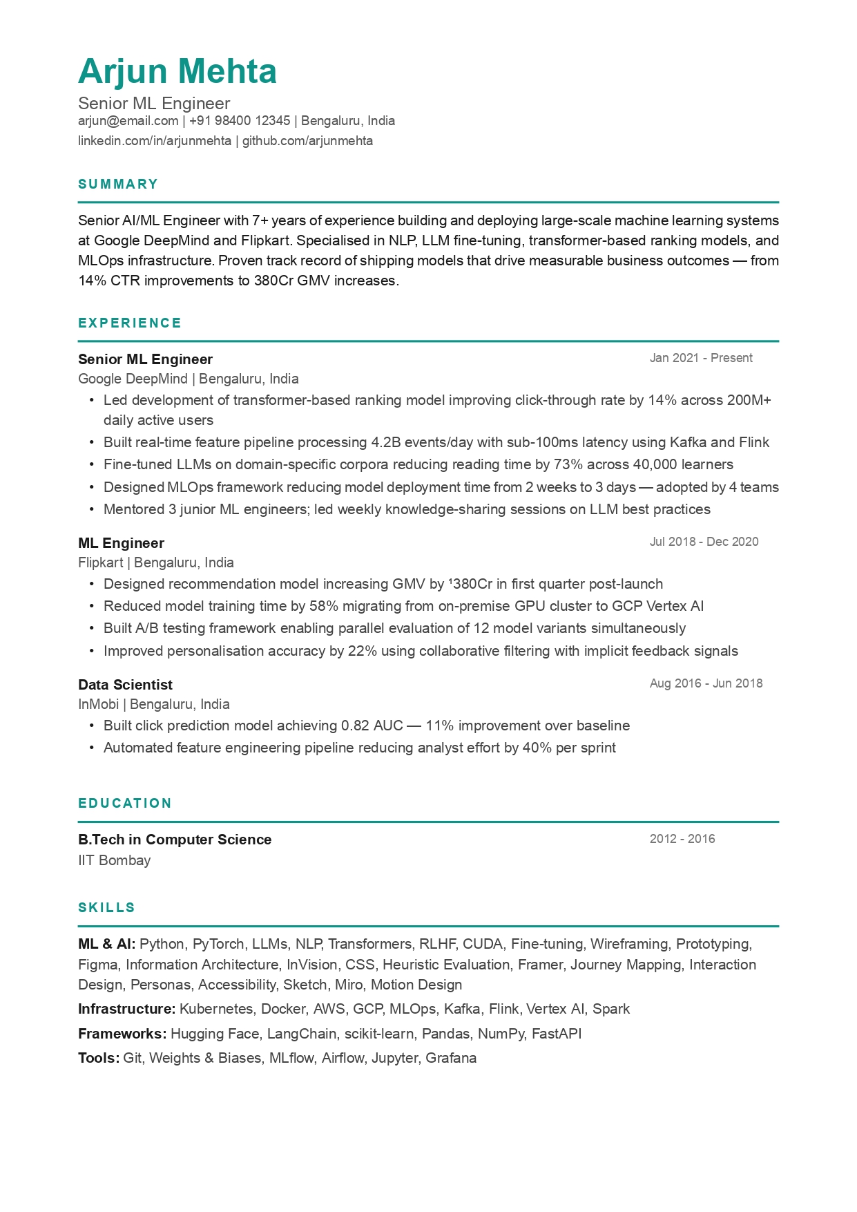
Classic ATS Resume Template
Scores 95+ on every major ATS. The most battle-tested format on CVEdge.
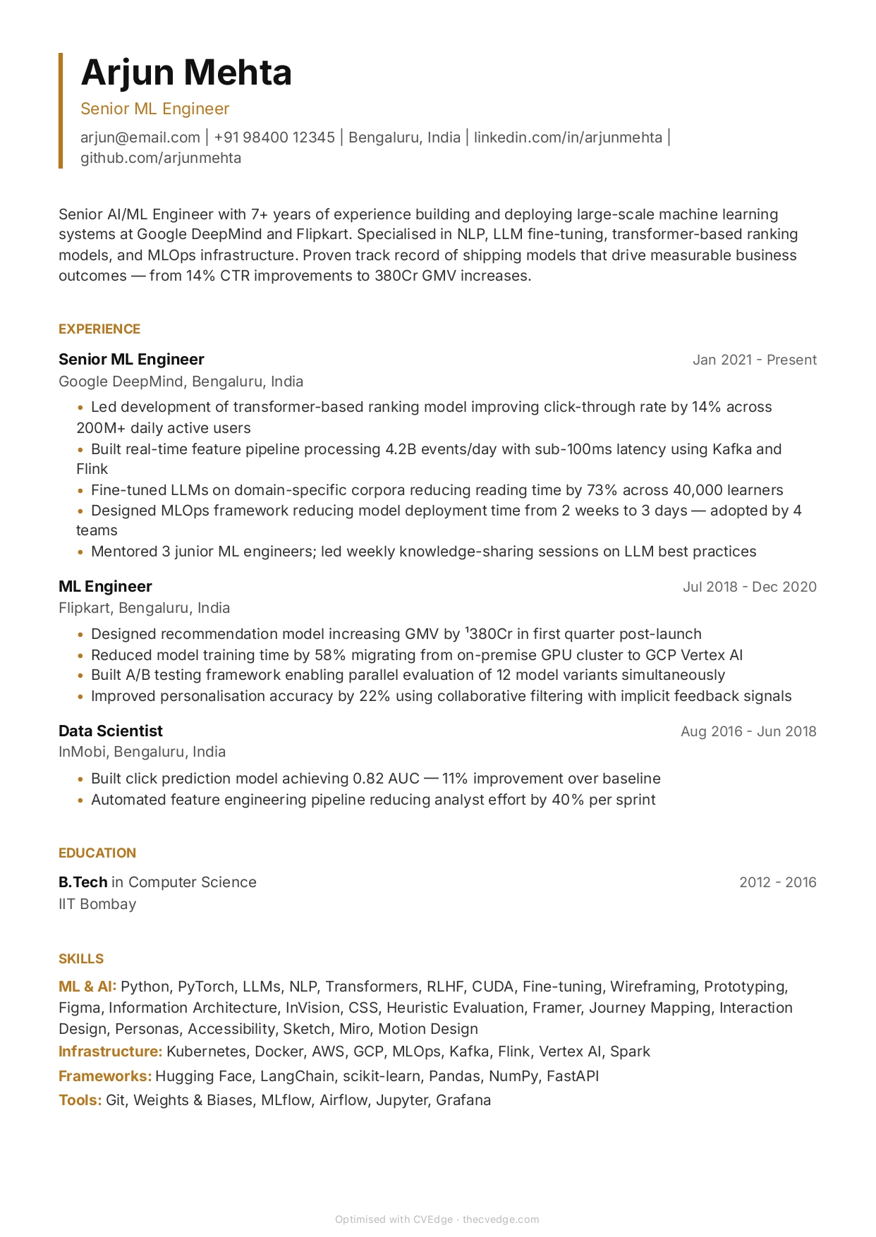
Sharp ATS Resume Template
Bold and modern — passes ATS while looking more contemporary than Classic.
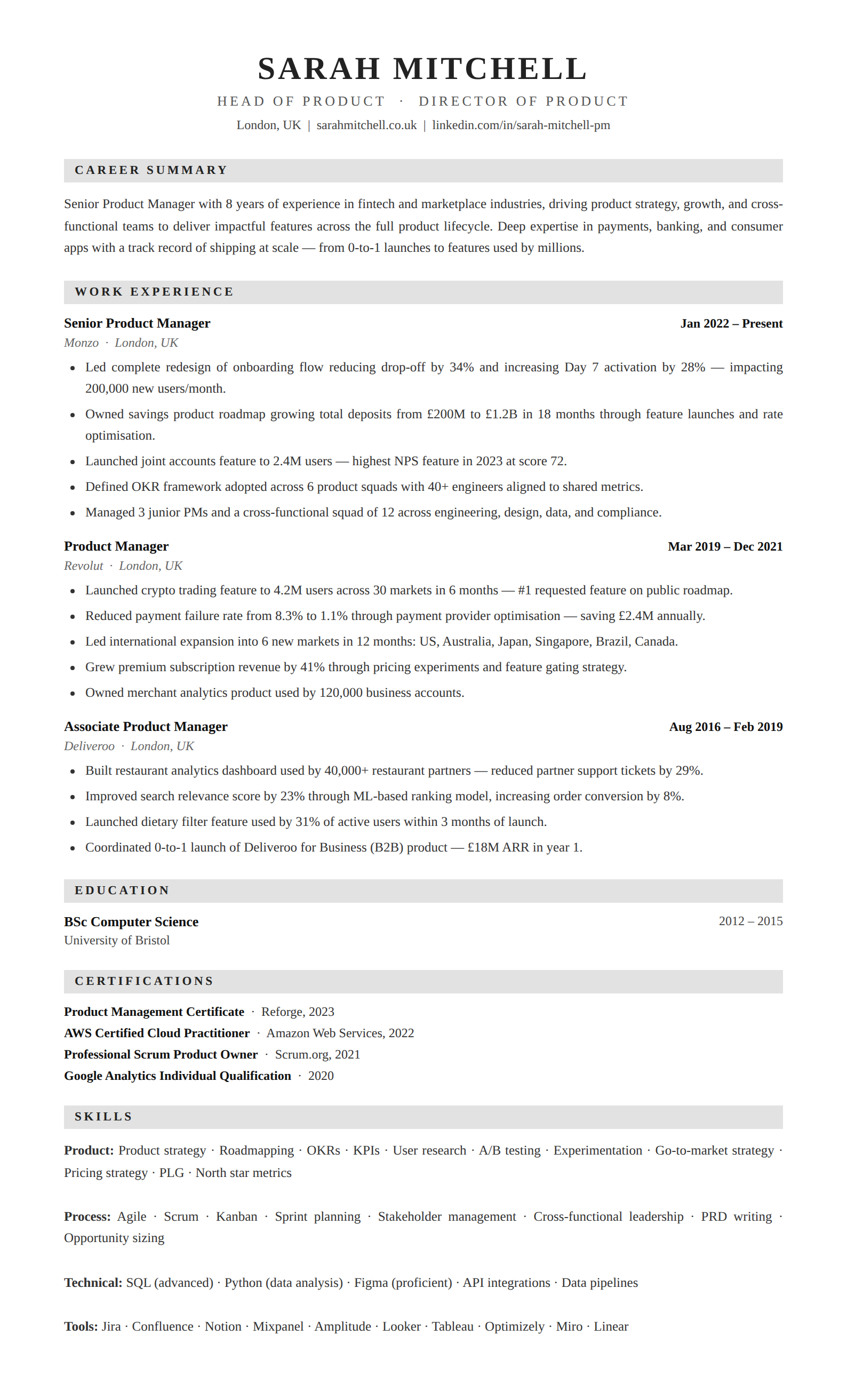
Classic Serif ATS Resume Template
Formal and ATS-safe. Grey section bands with elegant serif for traditional industries.
Build your resume with Minimal — free
Upload your existing CV or start fresh. ATS score included. No credit card required.