

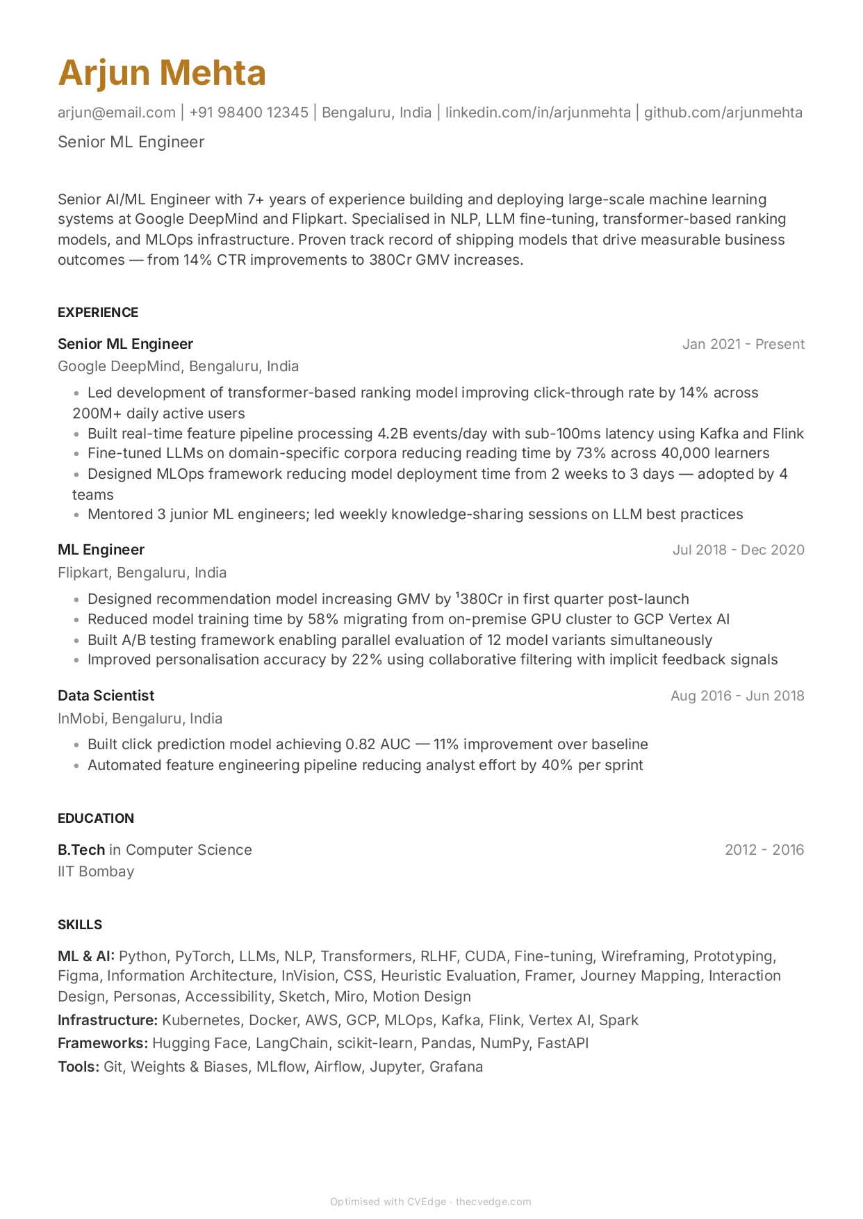
Minimal Resume for Fresh Graduates
Elegant whitespace that makes limited experience look intentional, not sparse.
No credit card · No watermarks · Switch templates any time
About this template
Minimal works surprisingly well for fresh graduates when you have strong content to fill it. The generous whitespace isn't empty — it signals confidence. Rather than cramming every detail to fill space, Minimal says: here is my best work, clearly stated.
For CS graduates with strong GitHub projects, design students with portfolio work, or finance graduates from target schools, Minimal's restrained style positions you as someone who understands quality over quantity.
The challenge with Minimal for freshers is having enough strong bullets per section. You need at least 2 substantial bullet points per experience/project (not just descriptions — outcomes). Use CVEdge's AI bullet rewriter to turn "Worked on React frontend" into "Built customer-facing checkout flow handling 10K monthly transactions, reducing drop-off by 22%." Then Minimal looks great.
Avoid Minimal if you have fewer than 3 substantial experiences or projects to list.
Who is this template for?
- CS and engineering graduates with strong GitHub portfolio
- Design students with portfolio work
- Finance and business graduates from target schools
- Graduates who want their work to speak without decoration
Start with this template — free
Upload your existing CV or start from scratch. CVEdge pre-fills your content into the template and gives you an instant ATS score.
Why this template works for freshers & entry level
Minimal suits graduates applying to startups, product companies and modern tech employers, where a formal corporate document can read as a poor fit. Its restraint also flatters a light CV — there is no dense structure sitting half-empty, which is the trap graduates fall into with heavier layouts.
Recommended section order
- 1Contact
- 2Education
- 3Projects
- 4Experience
- 5Skills
Same graduate logic as Classic, but keep it tighter still. Minimal depends on nothing being longer than it needs to be, so drop the activities section unless a role there genuinely demonstrates something.
What to put where
Education
Two or three lines. Institution, degree, year, classification if strong.
Projects
Two, described well, each with a link. Minimal rewards depth over breadth — three sentences on one real project beat one line on four.
Experience
Internships and part-time work, one or two bullets each with an outcome where you can name one.
Skills
A single short grouped line. This layout makes a long skills list look particularly padded.
Common mistakes with this template
- Adding graphics or skill bars to fill the whitespace, which defeats the design and adds parsing risk.
- Stretching thin content across a full page with oversized spacing, which is transparent.
- Using a casual register because the design is modern — the writing should still be professional.
When to choose something else
Graduate schemes at banks, law firms and traditional professional services will usually be better served by the Classic Serif layout.
Questions about this template
Does Minimal look too empty for fresher resumes?+
Only if you have fewer than 3 substantial experiences or projects. With 3+ well-written entries, the whitespace reads as confident curation. Use CVEdge's AI rewriter to strengthen each bullet first.
Is Minimal better than Classic for graduate applications?+
Minimal is better if your content is strong and you're targeting companies that value craft (tech, design, consulting). Classic is safer for volume applications across multiple industries.
Is a minimal resume too informal for graduate applications?+
It depends on the employer, not the format. At startups, product companies and most modern tech employers it reads as current and considered. At banks, law firms, consultancies and traditional graduate schemes, a more conventional document matches the register better. The design is neutral either way — what would actually read as informal is casual language, which you control separately.
How do I fill a page with limited experience?+
With substance rather than spacing. Expand projects — what the problem was, what you built, what technology, what happened. Add relevant coursework, a short section on societies or volunteering with actual responsibilities, and any part-time work. If it is still thin, that is a signal to go and build something small rather than to increase the line spacing.
Template features
- Generous whitespace signals content quality over volume
- Perfect contrast for strong metric-led bullets
- Single column — full ATS compatibility
- Elegant typography for target-school graduates
- Looks premium even with limited content
More freshers & entry level templates
View all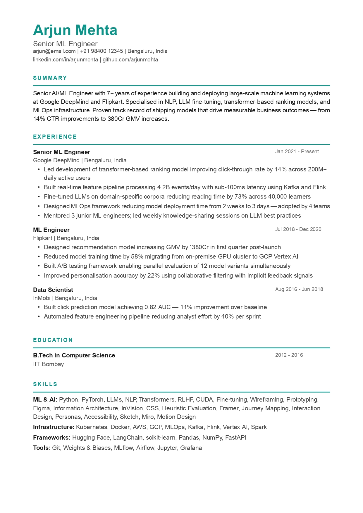
Classic Resume for Freshers & Graduates
Clean, structured, and easy to fill. The safest first resume for any industry.
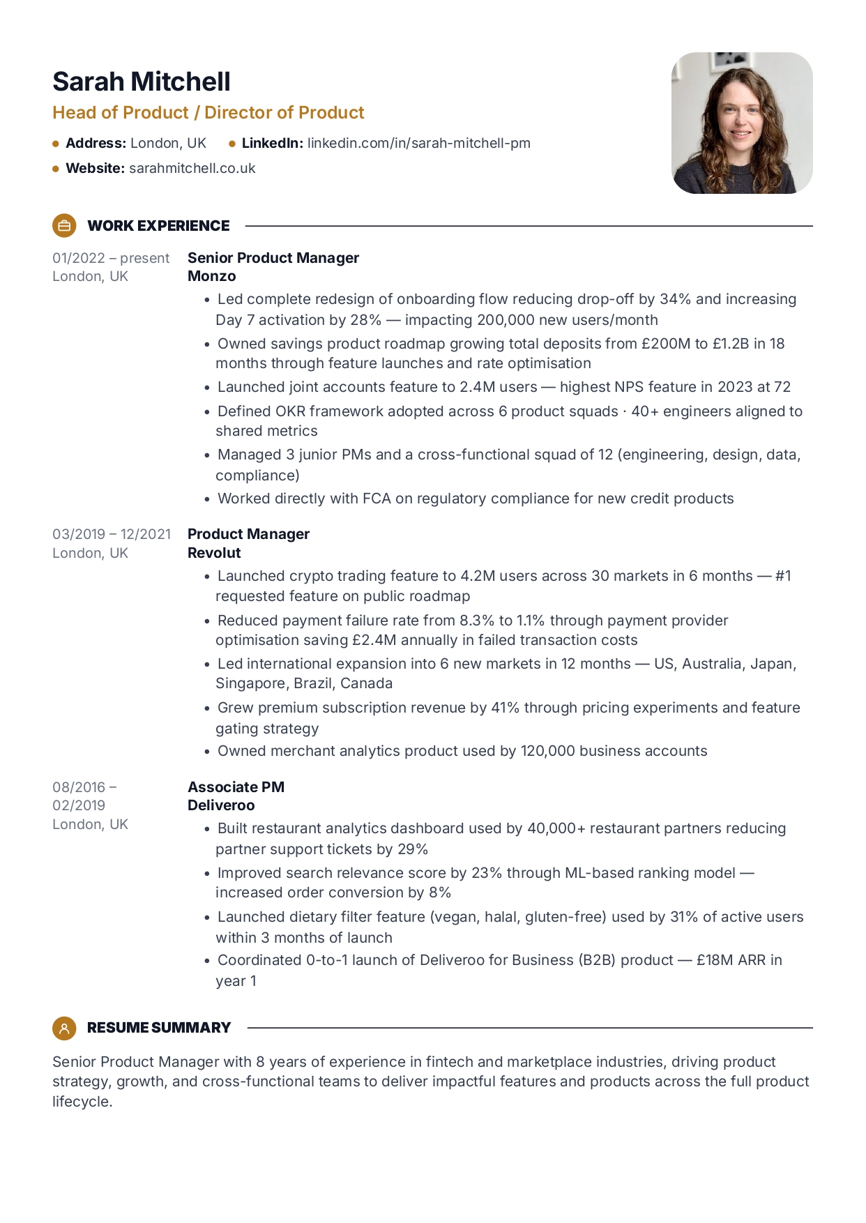
Bold Accent Resume for Freshers
Modern, energetic. Chips and sections hide thin experience beautifully.
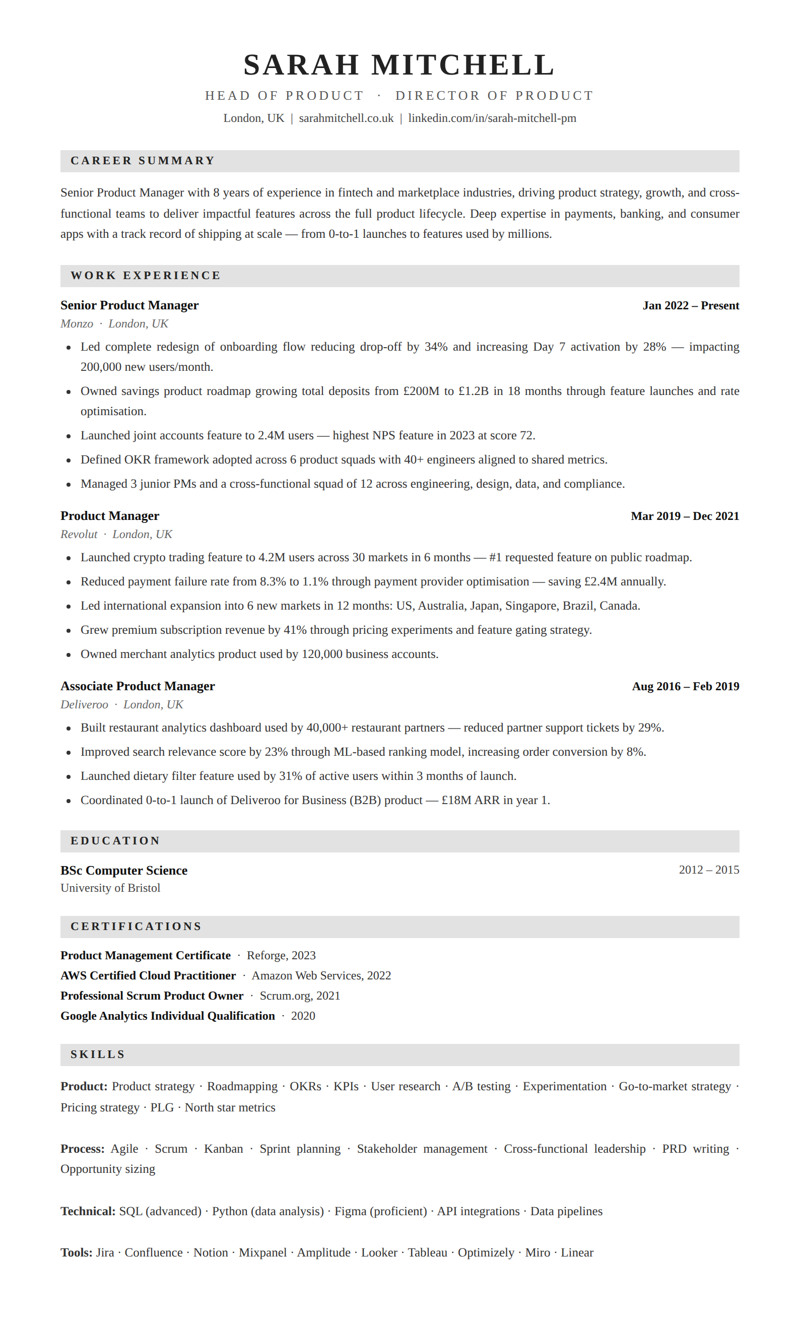
Classic Serif Resume for Graduates
Elegant serif typography for finance, law, consulting, and academic applications.
Build your resume with Minimal — free
Upload your existing CV or start fresh. ATS score included. No credit card required.