

Graphite Black and White Resume Template
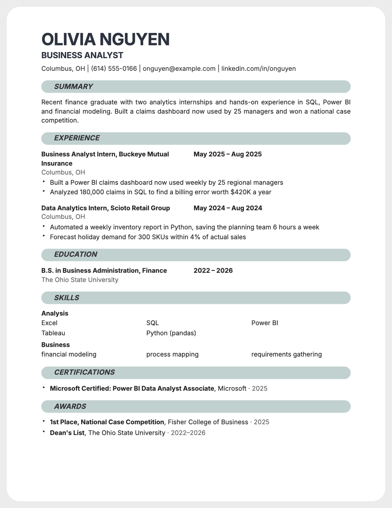
A white rounded card on a grey canvas, grey pill headings, nothing else. Simple by design.
No credit card · All templates free · Switch templates any time
About this template
Graphite is a black-and-white resume with one structural idea: the page is a white card with rounded corners on a light grey canvas, and each section starts with a full-width grey pill carrying an italic heading. The result looks composed on screen and in print without using a single color.
The body is single column. Experience lines put the role and company in bold with the dates aligned in a second column, and skills lay out in a three-column grid so twelve tools fit in four lines. Summary text is justified, which suits the card's clean edges.
Graphite is built for UX designers, engineers and analysts who want a resume that shows judgment without a portfolio moment. The pills take a faint tint from your accent color if you set one, so a navy or green accent adds warmth without breaking the monochrome feel.
Who is this template for?
- UX and product designers
- Engineers and analysts who want a clean monochrome resume
- Candidates applying to design-aware tech companies
- Anyone who prefers structure over color
Start with this template for free
Upload your existing resume or start from scratch. CVEdge pre-fills your content into the template and gives you an instant ATS score.
Why this template works for creative roles
Graphite is for people who want a resume that looks designed without using any color: UX and product designers, engineers and analysts at design-aware companies. The white card on a grey canvas and the pill headings give the page a clear structure, and the body stays single column, so it parses as cleanly as Classic. It signals care and judgment without asking the reader to forgive a busy layout.
Recommended section order
- 1Header: name, title, contact
- 2Summary
- 3Experience
- 4Projects
- 5Skills
- 6Education
Experience comes straight after a short summary because that is what a hiring manager reads first. Designers and engineers should add Projects before Skills: a shipped project is stronger proof than a list of tools.
What to put where
Summary
Graphite justifies the summary text, so keep it to two or three full lines. A short summary leaves gaps that the justification makes more obvious.
Experience
Role and company in bold, dates aligned to the right. For each role, lead with the product or system you worked on, then the results you drove.
Projects
Two or three, each with the problem, what you did and the outcome. For designers, link the case study. For engineers, link the repo or the live product.
Skills
The three-column grid fits about twelve items in four lines. Group by type, such as tools, methods and languages, and drop anything you would not want to be asked about.
Common mistakes with this template
- Adding a strong accent color. The pills take a faint tint, which is enough. A saturated accent fights the monochrome design.
- Writing a one-line summary. Justified text looks unfinished when it is that short.
- Listing more than twelve skills. The grid gets crowded and the strongest items get lost.
- Using Graphite in place of a portfolio for design roles. It shows judgment, but reviewers still need to see your work.
When to choose something else
Designers whose application is judged mainly on visual style, such as brand and art direction will usually be better served by the Portrait layout.
Questions about this template
Does the card layout affect ATS parsing?+
No. The card and pills are backgrounds behind normal single-column text. Parsers read Graphite exactly as they read Classic.
Can Graphite show colour?+
The pills take a subtle tint from your accent color. Names and text stay dark so the template keeps its black-and-white identity.
Is a black and white resume a good idea?+
Yes. It prints well, reads well on any screen and never clashes with the company's own brand. Recruiters judge the content, so a monochrome layout keeps their attention there. Graphite adds structure with grey shapes, so the page still looks considered.
What should a UX designer put on a one-page resume?+
A two-line summary, three or four roles with the products you worked on and the results, two or three projects linked to case studies, and a short skills grid. Leave out process diagrams and long tool lists. The portfolio shows the process. The resume shows the impact.
Template features
- White rounded card on a grey canvas
- Full-width grey pill headings in italic
- Three-column skills grid
- Two-column entry lines with aligned dates
- Single column, parses cleanly
More creative roles templates
View all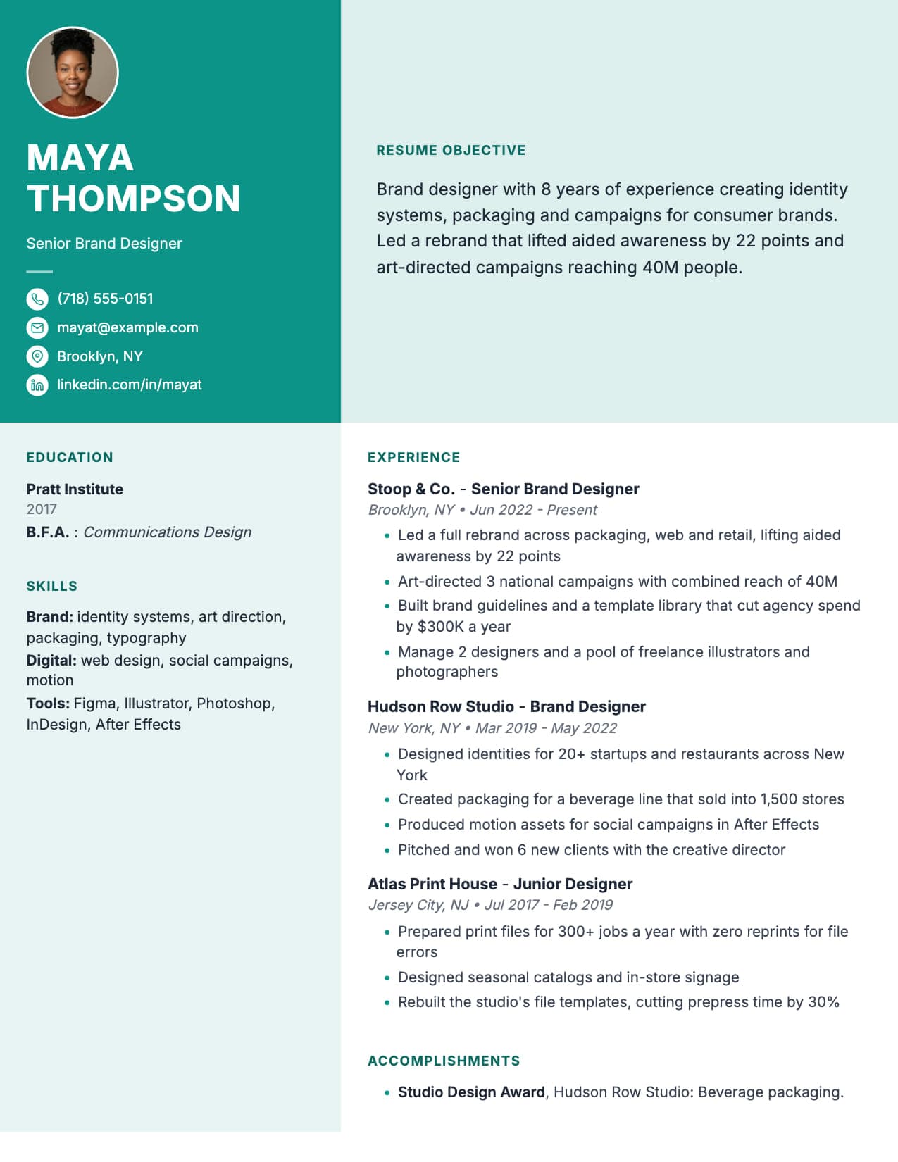
Electric Lilac Resume for Creative Roles
Vibrant sidebar, bold columns. You get noticed before they read a word.
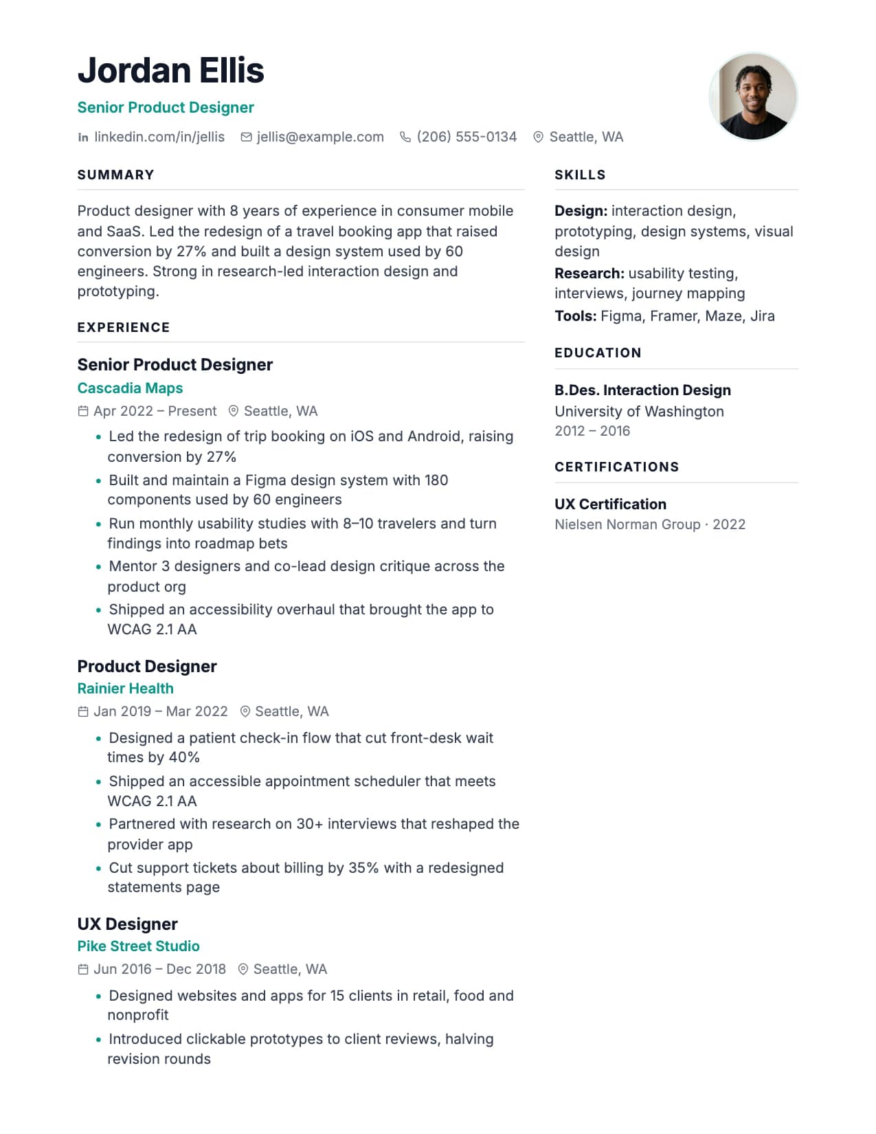
Aurora Resume for Creative Professionals
Chips, avatar, two columns. Portfolio-meets-resume energy for creative roles.
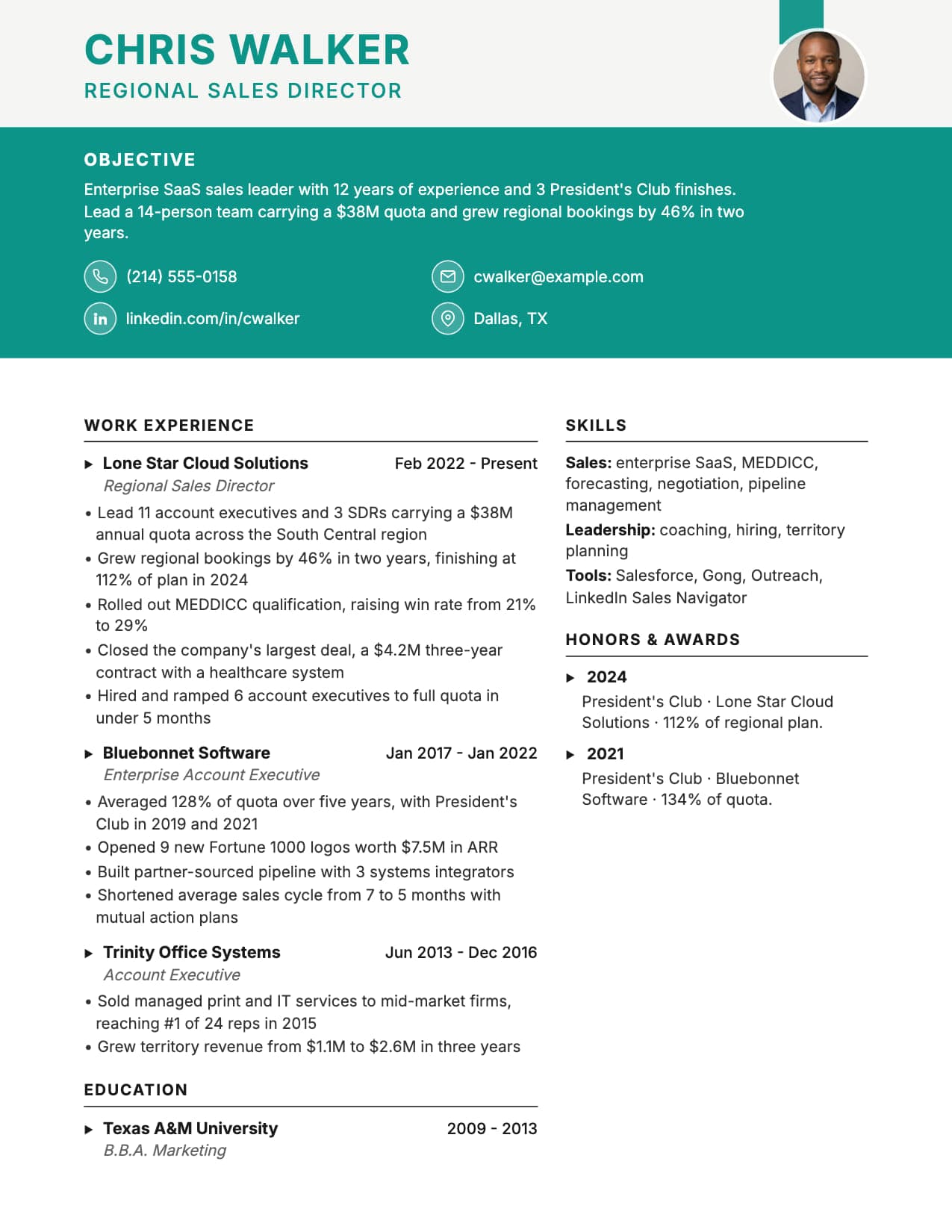
Coastal Resume for Creative Professionals
Teal header band with photo and objective band. Strong personal branding.
Build your resume with Graphite for free
Upload your existing resume or start fresh. ATS score included. No credit card required.